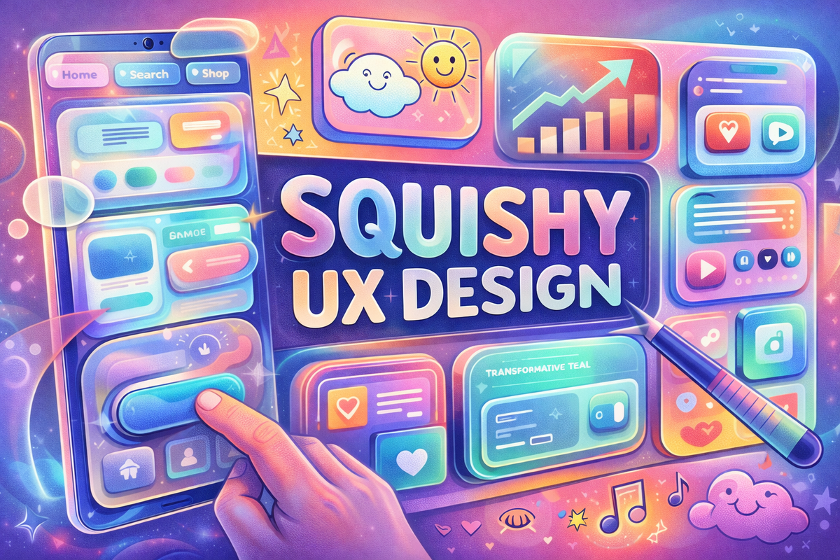
As the digital landscape pivots from the clinical detachment of flat design, a new era of "Tactile Surrealism" is redefining how we interact with our screens. This shift, led by a surge in organic textures and responsive depth, suggests that the internet is finally trading its cold efficiency for a more visceral, human pulse.
It has been accused of being sterile, devoid of soul, and increasingly indistinguishable from its competitors. It has spent years hiding behind "safe" white space and predictable sans-serif fonts.
It isn’t a failing tech startup. It is the modern internet.
But as 2025 gives way to 2026, the digital world began to melt. From the headquarters of Apple in Cupertino to the studios of independent designers in Berlin, a new aesthetic is taking hold. The era of "Sad Beige" minimalism is being replaced by something more tactile, more fluid, and—critically—more human.
The Rise of ‘Liquid Glass’
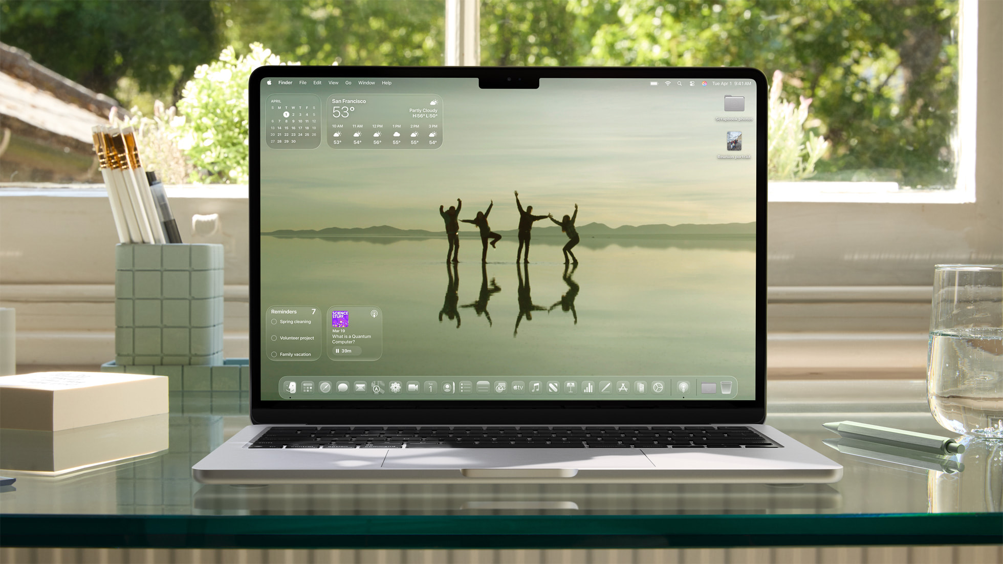
The most visible shift comes from Apple. With the release of its latest software updates, the tech giant introduced Liquid Glass, a material that behaves less like a static image and more like a physical element. Unlike the "Glassmorphism" of previous years, which merely blurred the background, Liquid Glass refracts light in real-time.
When a user scrolls, the interface "flexes." Buttons no longer just click; they depress like soft clay. This "Squishy UI" marks a return to a more tactile world, one where the boundary between the glass in your hand and the light on the screen is increasingly blurred.
Typography Reclaims the Lead
For a decade, the "Modern" website was defined by its invisibility. The goal was to stay out of the user’s way. Now, typography is the hero. Text is no longer just a carrier for information; it is the "vibe" itself. We are seeing a surge in:
- Kinetic Type: Headlines that stretch and breathe as you interact with them (Source: UX Design Institute).
- Hero Serifs: A return to high-contrast, elegant fonts that feel like a high-end magazine rather than a spreadsheet.
- Hand-Drawn Imperfection: Doodles and "lo-fi" accents that signal a human was actually behind the screen, a crucial trust signal in the age of generative AI (Source: Adobe Blog: Four Creative Trends).
The ‘Bento’ Layout: Organized Chaos
If the old internet was a grid of rigid columns, the new internet is a Bento Box. Popularized by Apple’s hardware marketing and now ubiquitous in web design, the Bento Grid organizes information into rounded, modular "pods."
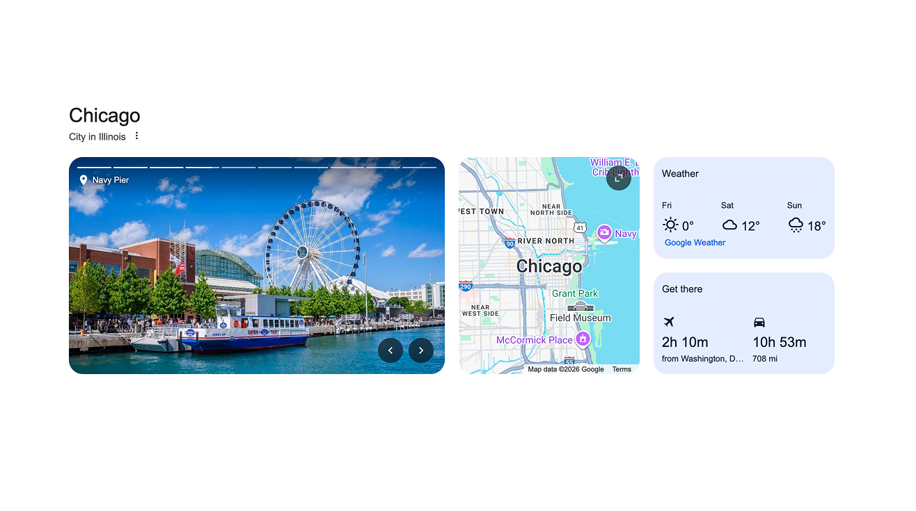
It is a paradox: perfectly organized yet visually rich. It allows for high information density without the claustrophobia of the old web. It is "Main Character" design—every piece of content is given its own stage, its own rounded corner, and its own depth.
Be Careful What You Design For
However, this move toward the "maximalist" and the "puffy" isn't without its critics. Analysts warn that as designs become more decorative, accessibility can suffer. Trust and perceived fairness now significantly influence user retention.
“The problem for designers might well be that they try to out-aesthetic each other at the expense of the user,” says one analyst. “In a world where everything is glowing, squishy, and moving, where does the user find the exit button?”
For now, the industry seems happy to play in the light. From Transformative Teal to Future Dusk, the world may be looking for stability, but on our screens, we’ve decided it’s time for a little more magic.